
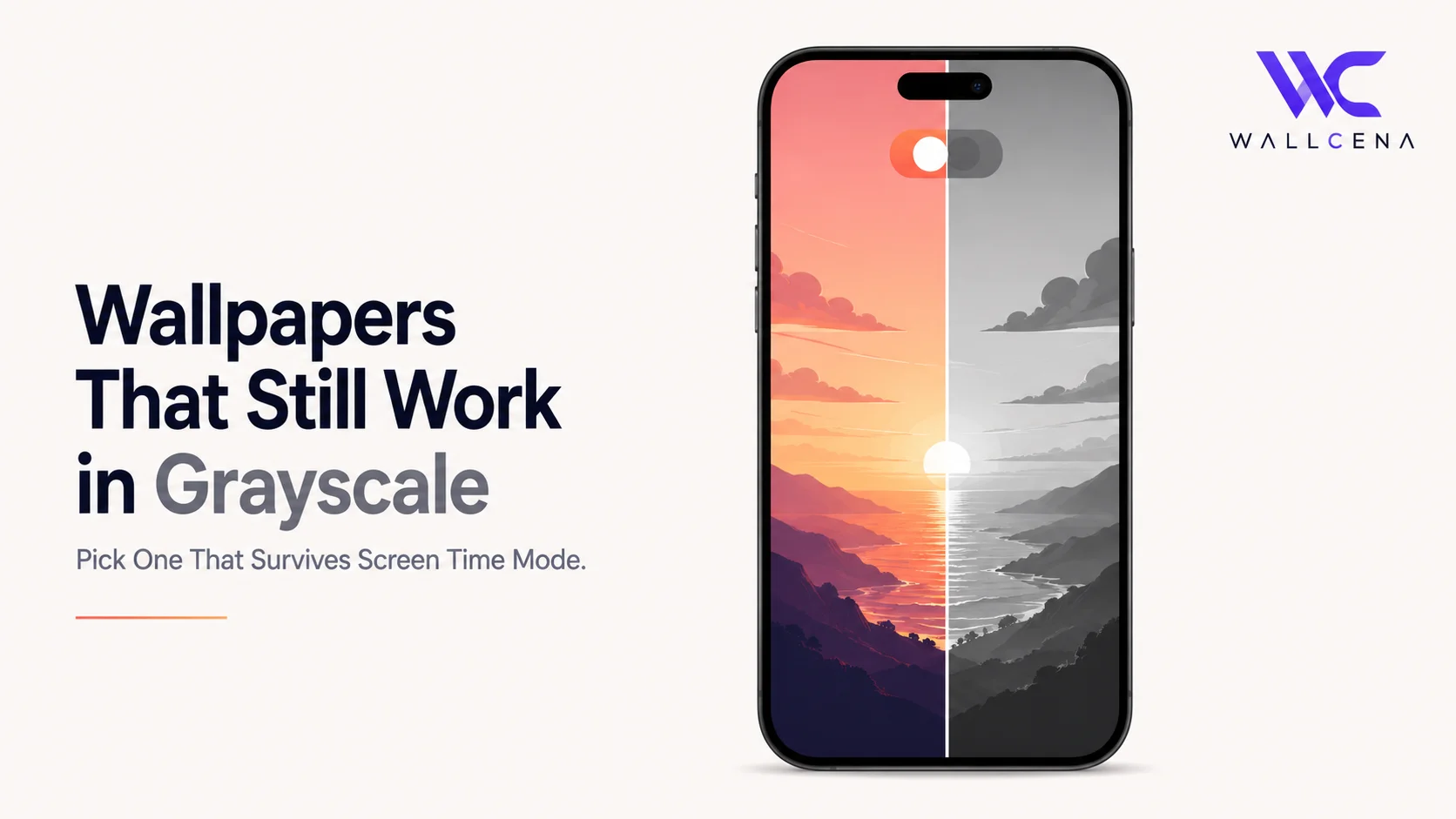
Why Grayscale Mode Ruins So Many Wallpapers
Grayscale mode has become a popular, research-backed trick for cutting down phone use. Studies have found that switching a phone to grayscale can reduce daily screen time by roughly 20 to 38 minutes on average, and one widely shared personal experiment reported screen time dropping by nearly 19% over a week. The idea is simple: color is one of the main ways apps and screens grab your attention, so removing it makes the whole experience less stimulating.
The tradeoff nobody warns you about: your carefully chosen wallpaper often looks completely different once color disappears. A vibrant sunset can turn into a muddy gray blob. A colorful abstract design can lose all its shape and definition. If you're using grayscale mode to reduce screen time, it's worth picking a wallpaper that was actually built to hold up without color, rather than one that only works because of it.
How to Turn On Grayscale Mode (If You Haven't Yet)
iPhone
- Go to Settings → Accessibility → Display & Text Size → Color Filters
- Toggle Color Filters on, then select Grayscale
- For quick toggling, set up an Accessibility Shortcut: Settings → Accessibility → Accessibility Shortcut → select Color Filters, then triple-click the side button to switch on and off
Android
- Go to Settings → Digital Wellbeing & parental controls
- Look for a Grayscale or Bedtime mode option, which can also automatically switch your screen to grayscale at set times
Why Some Wallpapers Look Fine and Others Fall Apart
Once color is removed, your screen relies entirely on brightness contrast — how light or dark different parts of the image are — to show any shape or detail at all. This is exactly why certain wallpapers survive the switch and others turn into a flat, indistinguishable gray field.
- Wallpapers that rely purely on different colors of similar brightness (like a red and green pattern with no light/dark contrast) tend to collapse into a single gray tone, losing all definition
- Wallpapers with strong light-to-dark contrast — a bright sky against a dark mountain silhouette, for example — hold their shape well, because the contrast that made them readable was never dependent on color in the first place
- Busy, highly saturated wallpapers often look worse in grayscale than simpler ones, since the loss of color removes the main thing separating different elements of the image
What Actually Works Well in Grayscale
- High-contrast black and white photography — since it was never relying on color to begin with, it looks identical or even more striking in grayscale
- Simple silhouettes and clean compositions — a single subject against a plain sky or background reads clearly regardless of color
- Minimal wallpapers with strong shape contrast — geometric designs with clear light and dark areas rather than color-dependent patterns
- Architectural and structural photography — buildings, bridges, and interiors often rely on light, shadow, and form rather than color, translating well
What to Avoid If You Use Grayscale Regularly
- Wallpapers where the main subject and background are similar in brightness but different in color — these are the ones most likely to become unreadable
- Neon or highly saturated designs, which often go completely flat and muddy without color to carry them
- Busy, detailed collages where color was doing the job of separating different elements from each other
A Practical Way to Test Before Committing
Since grayscale mode is easy to toggle on and off, the simplest approach is to preview any wallpaper you're considering directly on your device: set it, switch grayscale on briefly, and check whether it still looks intentional rather than muddy. This takes seconds and avoids the disappointment of committing to a wallpaper that only worked because of its color.
Why This Matters Beyond Just Aesthetics
If part of the reason you're using grayscale mode is to make your phone feel less like a "slot machine" and more like a plain tool, a wallpaper that still looks sharp and intentional supports that goal — a muddy, undefined background can end up feeling more like something went wrong than a deliberate design choice, which works against the calm, low-stimulation environment grayscale mode is meant to create in the first place.
Frequently Asked Questions
Does grayscale mode actually reduce screen time?
Research suggests it can. Multiple studies have found reductions ranging from roughly 20 to nearly 40 minutes of daily screen time, generally attributed to color being one of the main ways apps hold attention.
Will my photos and videos be saved in black and white if I use grayscale mode?
No. Grayscale mode is only a display filter — it changes how content appears on your screen but doesn't alter the actual photo or video files, which stay in full color.
Why does my wallpaper look muddy or flat in grayscale?
This usually happens when the image relies on color contrast rather than brightness contrast to show detail. Once color is removed, similarly bright areas of different colors blend together into a flat gray tone.
Can I quickly switch between grayscale and color to check my wallpaper?
Yes. Setting up an Accessibility Shortcut on iPhone (or a Quick Settings tile on Android) lets you toggle grayscale on and off in seconds, making it easy to preview how a wallpaper looks either way.
Find a Wallpaper Built to Survive Grayscale
Browse our high-contrast and minimal wallpaper categories — the kind that hold their shape and detail whether your screen is in full color or grayscale.
Community
Comments (0)
Log in to like and comment.
No comments yet. Be the first to comment.