
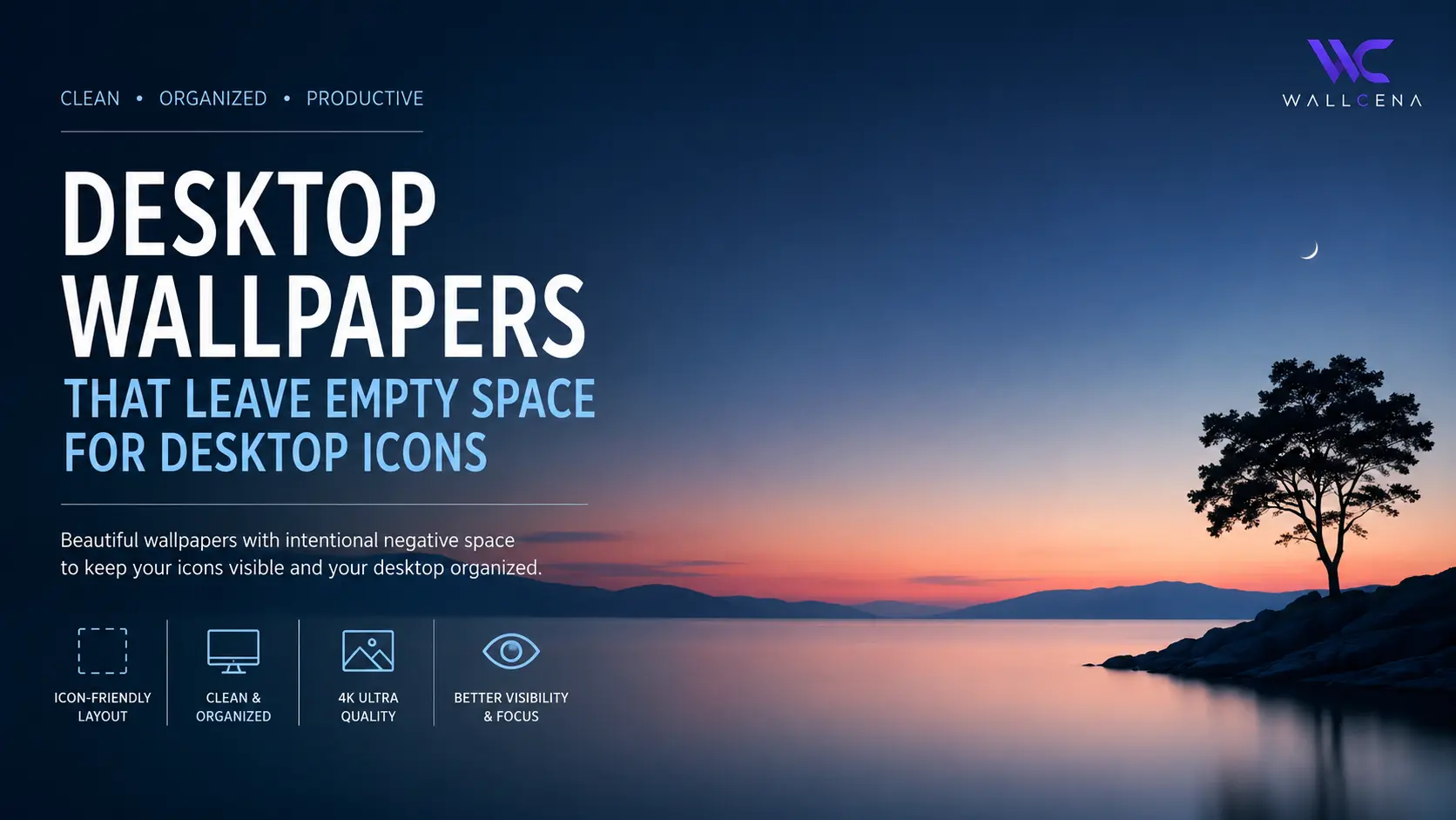
Why Empty Space Matters in a Desktop Wallpaper
Your desktop wallpaper does more than decorate the screen. It sits behind your folders, shortcuts, applications, widgets, and other interface elements every time you use your computer.
When a wallpaper is packed with buildings, characters, bright textures, or detailed scenery across the entire screen, desktop icons can become difficult to recognize. A wallpaper with carefully placed empty space solves this problem by giving your icons a calm visual area to sit on.
This style is often called negative-space wallpaper. Instead of trying to fill every part of the image, the composition deliberately leaves quieter areas where the desktop interface can remain visible.
What makes empty space useful?
- Desktop icons remain easier to identify.
- Text labels are less likely to disappear into busy backgrounds.
- The wallpaper feels cleaner even when many shortcuts are present.
- Important subjects in the artwork stay visually separated from your desktop controls.
- The overall desktop can look more organized without removing your favorite icons.
The goal is not necessarily to use a completely plain wallpaper. The best designs combine visual interest with a deliberately quiet section of the image.
Where Should the Empty Space Be?
The ideal position of empty space depends on how your desktop icons are arranged. On many Windows desktops, icons are commonly grouped toward one side of the screen, while other users arrange shortcuts across multiple areas.
Rather than choosing a wallpaper simply because it looks attractive in isolation, consider where your icons actually appear.
Left-side icon layouts
If your desktop icons are mostly aligned on the left, look for wallpapers with darker, softer, blurred, or less detailed areas on the left side. The main visual subject can remain on the right, creating a natural balance.
Right-side icon layouts
For a right-aligned setup, reverse the composition. A large area of calm background on the right side can provide a much cleaner surface for folders and shortcuts.
Icons spread across the screen
If you use many desktop shortcuts across the entire screen, choose a wallpaper with low visual complexity instead of concentrating all the empty space into one corner.
Subtle gradients, fog, soft skies, dark shadows, simple architecture, and wide areas of a single color can work particularly well for this setup.
Wallpaper Preview: Empty Space for Desktop Icons
View This Desktop Wallpaper
A desktop-focused wallpaper with intentional negative space for icons and shortcuts.
 Red Moon EclipseView Wallpaper
 How to Choose a Wallpaper Without Hiding Your Icons
A useful rule is to compare the wallpaper with your actual desktop rather than viewing the image by itself. A design that looks incredible in a full-screen preview can become distracting once dozens of icons are placed over it.
1. Look for low-detail areas
Large areas of sky, walls, shadows, mist, water, gradients, and softly textured surfaces are excellent backgrounds for icon clusters. They provide enough variation to keep the image attractive while avoiding excessive visual noise.
2. Avoid placing the focal point behind icons
If the wallpaper features a car, person, mountain peak, building, animal, or other important subject, check where it sits in the composition.
A simple trick is to keep the main subject away from the area where your icons normally appear. This allows both the artwork and the interface to remain visually clear.
3. Consider contrast
Icon labels usually need enough contrast against the background to remain readable. A wallpaper that places bright text over bright scenery can make filenames difficult to see, while an extremely dark image can sometimes reduce the impact of darker interface elements.
Medium-to-dark backgrounds, gentle gradients, and controlled highlights are often a practical choice for busy desktops.
4. Think about icon density
The number of icons on your desktop should influence your wallpaper choice.
- Few icons: You can use more detailed artwork without creating much clutter.
- Moderate icon count: Look for one clearly defined quiet area.
- Many icons: Choose a simple composition with broad areas of low detail.
Best Wallpaper Styles for a Clean Desktop
Minimal landscape wallpapers
Wide landscapes are especially useful because they naturally contain large areas such as skies, mountainsides, fields, water, and distant scenery. These areas can provide negative space without making the wallpaper appear empty.
Dark architectural wallpapers
Buildings, corridors, concrete walls, and modern interiors can create excellent desktop backgrounds when the composition uses shadows and clean surfaces instead of dense details.
Soft gradient wallpapers
Gradients are one of the simplest solutions for icon-heavy desktops. They offer visual depth while maintaining a relatively consistent surface behind folders and shortcuts.
Minimal abstract wallpapers
Abstract designs can work particularly well when their shapes are positioned away from the icon area. Look for compositions with a strong visual anchor on one side and smoother color transitions on the other.
Foggy and atmospheric scenes
Mist, fog, clouds, and atmospheric light naturally reduce visual detail. This makes them useful for users who want an artistic wallpaper without sacrificing desktop readability.
Choosing the Right Resolution and Aspect Ratio
A wallpaper should also match the shape of your monitor as closely as possible. Using an image with a very different aspect ratio can cause important empty areas to be cropped away.
For example, a composition designed with open space on the far left may lose that advantage when the image is aggressively cropped to fit another screen.
- Check your monitor resolution before choosing the wallpaper.
- Prefer wallpapers designed for your screen's aspect ratio.
- Make sure the important subject stays visible after cropping.
- Check that the negative-space area remains available on your actual display.
- Use higher-resolution artwork when you have a large or high-density monitor.
Wallpaper Preview: A Second Icon-Friendly Desktop Setup
View Another Icon-Friendly Wallpaper
A second wallpaper option designed around clean composition and useful negative space.
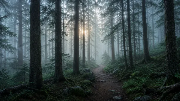 Dark Forest MistView Wallpaper
 How to Test a Wallpaper on Your Desktop
The easiest way to judge an icon-friendly wallpaper is to use it for a few minutes with your normal desktop layout.
Place the wallpaper on your monitor, return your usual shortcuts and folders, and look at the screen from a normal working distance.
Ask yourself these questions
- Can I quickly identify my most-used icons?
- Are the file and folder names easy to read?
- Does the wallpaper pull my attention away from the task I am doing?
- Is the main subject still visible?
- Does the composition feel balanced with my actual icon layout?
If the answer is yes to most of these questions, the wallpaper is doing its job. A good desktop background should enhance your workspace rather than compete with it.
Why Negative-Space Wallpapers Feel More Organized
There is a subtle visual advantage to leaving part of an image quiet. Your eyes can separate the wallpaper from the interactive elements of the desktop more easily.
Instead of every part of the screen competing for attention, the composition creates areas of visual rest. Your icons become part of the layout rather than appearing randomly placed over an unrelated image.
This is particularly useful for productivity-focused desktops, study setups, minimalist workstations, and computers that contain many frequently used shortcuts.
Final Thoughts
The best wallpaper for an icon-heavy desktop is not necessarily the most detailed or dramatic one. It is the wallpaper that works with your interface.
Look for deliberate negative space, sensible contrast, suitable resolution, and a focal point that does not collide with your icons. With the right composition, you can keep your shortcuts visible while still having a desktop that feels stylish and personal.
Once you start looking at wallpapers in terms of where the empty space is, rather than simply how attractive the image looks, it becomes much easier to build a clean desktop around your everyday workflow.
Community
Comments (0)
Log in to like and comment.
No comments yet. Be the first to comment.